
Inspiration, Design, and Implementation
This is going to be fairly short but I wanted to discuss my process of Inspiration, Design, and Implementation. It's applicable to many other scenarios than just this one, but this was particularly interesting to me and I wanted to share it.
Inspiration
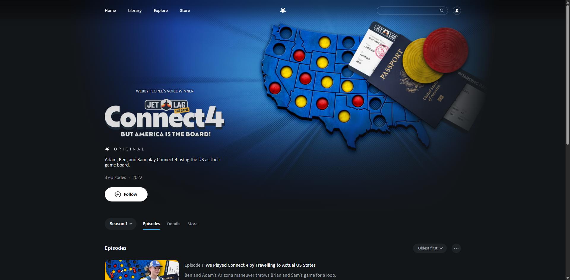
While scrolling through Nebula looking for a new show to watch, I found this beautiful UI feature that I couldn't stop thinking about. What stood out was a simple detail: the way the banner artwork subtly blended with both the background and the text It was so simple, yet so effective—and gave the show (and the page) a sense of personality that really stuck with me.
I decided I wanted to figure out how to implement this on my portfolio website, so I started to look into how I could do it.
Design
One of the easiest ways to figure out how something is implemented is to just have a look at the source itself. Soooo inspect element it was. Having a look at the image, it appeared to have roughly this structure:
- Absolutely positioned container div
- Background image
- A few overlayed divs with radial and linear gradients

My requirements to implement this myself was that I wanted:
- to have the component to be roughly applicable to most images—this would require pure CSS instead of photoshop
- to be able to use it in SvelteKit
- to be resizable and responsive
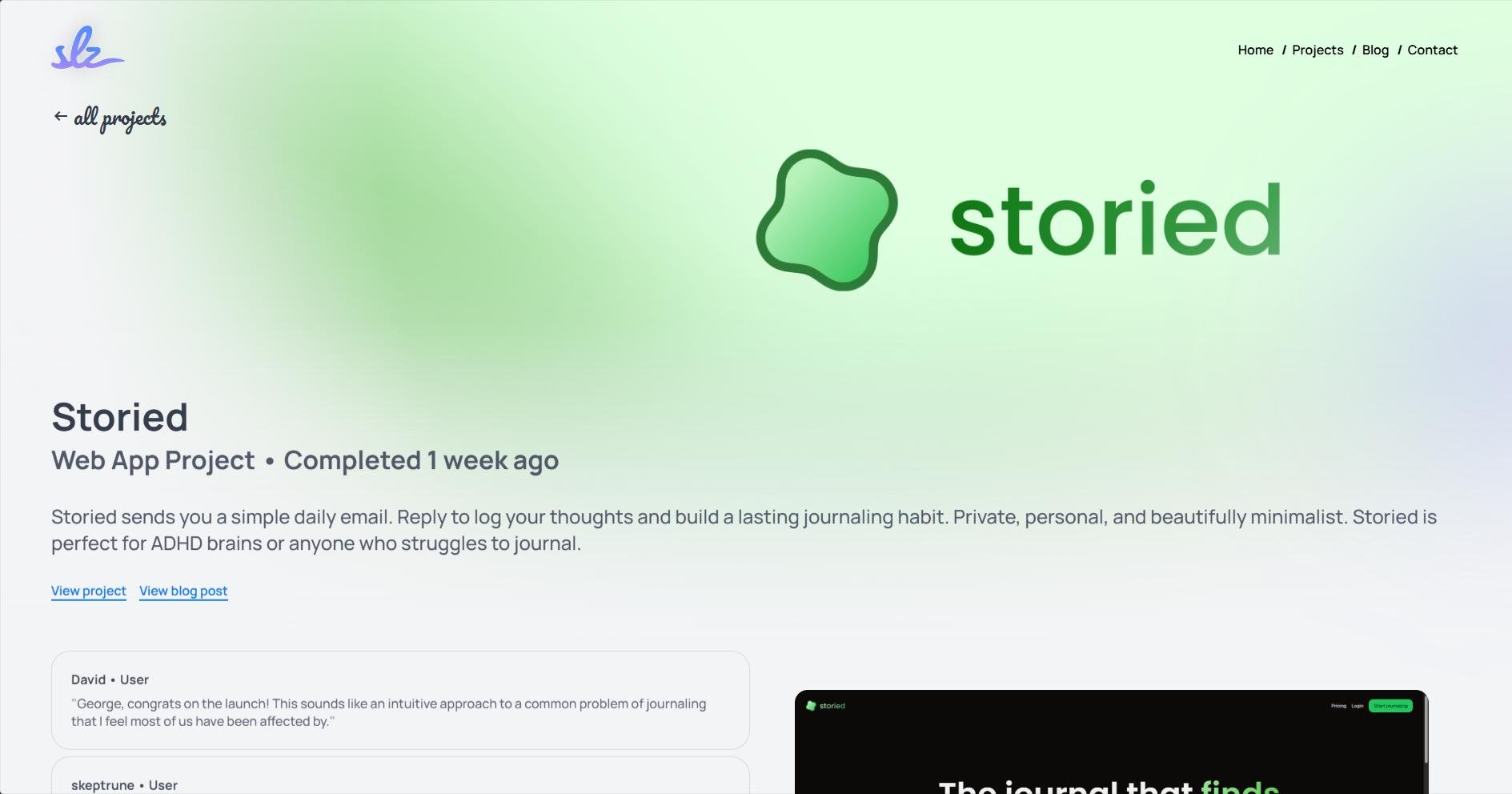
My end goal was to use it on my projects page for each individual project.
Implementation
This is typically the hardest part of the process and took me a few hours in this instance. I'm new to radial/linear gradients in CSS so I did a bit of research and found a few resources that helped me understand the baseline.
One particular site that helped a lot, even though it's fairly simple, was CSS Gradient They have a generator that is very helpful and I use it quite regularly for other projects!
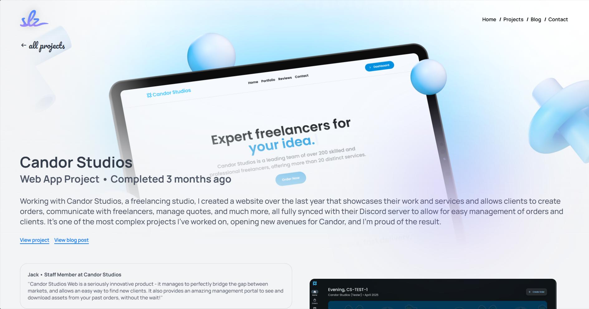
In the end, after a few hours, I managed to get the gradients working properly. A lot of this ended up being trial and error, tweaking each value until it carefully faded into the background. To make it easier, I used a red background to show the "blended"/hidden area of the image which made it much clearer to see what was going on.
This was the final layout:
- Absolutely positioned container div
- Background image
- 3 overlayed divs:
- A radial gradient that handles the left side of the image (pictured in red)
- A radial gradient that handles most of the bottom and some of the right side of the image (pictured in blue)
- A linear gradient that smooths off the rest of the bottom of the image. (pictured in yellow)
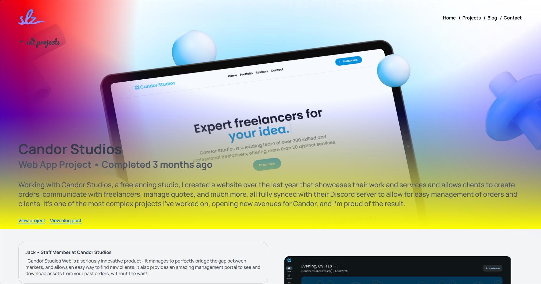
Since our image isn't a perfect square, I had to use a few tricks to get the gradients to blend properly. This was done by using a combination of background-size and background-position to get the gradients to line up with the image.
Here's an example of a few of the raw images:


This kind of visual treatment adds just a bit more trust. It makes the product feel ‘designed,’ not just thrown together—like it belongs in a launch event or a serious demo.
Result
Here was the final source code that did the trick:
    <div class="project-image-container">
            <div class="radial_1"></div>
            <div class="radial_2"></div>
            <div class="linear_1"></div>
            <img src="/{project?.banner_image || project?.image}" alt="Project image" class="project-image" />
    </div>
    .radial_1 {
        background: radial-gradient(circle,rgba(243, 244, 246, 0) 50%, rgba(243, 244, 246, 1) 70%);
        background-size: 200% 160%;
        background-position: 22% 100%;
        background-repeat: no-repeat;
    }

    .radial_2 {
        background: radial-gradient(circle,rgba(243, 244, 246, 0) 50%, rgba(243, 244, 246, 1) 70%);
        background-size: 150% 150%;
        background-position: 40% 140%;
        background-repeat: no-repeat;
    }

    .linear_1 {
        background: linear-gradient(180deg,rgba(243, 244, 246, 0) 50%, rgba(243, 244, 246, 1) 100%);
    }
(there are other styles but I removed them for simplicity)
The result was a beautiful UI that blended the image with the background and the text. It was simple, yet effective—and gave the page a sense of personality unique to each project.
Conclusion
I hope this post was helpful in showing you my process of Inspiration, Design, and Implementation. I think it's a great way to approach UI design and I encourage you to try it out for yourself.